The data on which the delineation is based comes from a variety of sources consistent with delineations from earlier decades. The raw data on journey to work counts and core-based statistical area (CBSA) delineations were accessed as tables directly from the census27,28,29, while county boundaries were accessed from the Census api using tidycensus30. Quarterly wage data for calculating evaluation metrics was acquired directly from the Bureau of Labor Statistics31.
The methodology for delineating 2020 CZ’s is meant to replicate the original method by Tolbert and Sizer32 with the adaptations to current data sources documented in Fowler et al.20. The evaluation metrics included with the data are those described in Fowler and Jensen21. The core concept underlying the delineation is a measure of connection between counties such that counties where a higher proportion of commuters travel between the counties represents a stronger connection. The metric, called ‘proportional flow,’ is:
$$\fracC_ij+C_ji\min \left(W_i,W_j\right)$$
where Cij and Cji represent the counts of commuters leaving county i for county j and leaving county j for county i respectively, and Wi and Wj are the total workforces of those two counties. Consistent with the original methodology any connection that achieved a value greater than 1 was reduced to 0.999; indicating maximum connectivity. The proportional flow matrix was then converted to a dissimilarity matrix by subtracting the proportional flow value from 1 and setting the diagonal of the resulting matrix equal to zero.
The delineation of commuting zones then uses hierarchical cluster analysis33 on this dissimilarity matrix with a cutoff value of 0.977 utilized in the 2010 delineations as described in Fowler et al.20. The result is a delineation with 593 commuting zones. Compared with 625 in 2010. The delineation includes six commuting zones for Puerto Rico, which was not included in the 2010 delineation. As noted in the technical validation below, alternatives to this cutoff value are worth exploring as it is somewhat arbitrary, but the value does have utility for maintaining consistency across delineations and there is no compelling evidence for the choice of an alternative in the range of descriptive and fit metrics covered below.
We can examine the degree to which cluster delineations are similar using the Jacand similarity for each county c where ten_c is the list of all counties in the same commuting zone as c in the 2010 delineation and twenty_c is the list of all counties in the same commuting zone as c in the 2020 delineation. The Jacand similarity is defined as:
$$Similarity_c=\frac\left$$
with a maximum of 1 and a minimum of 0. For this comparison to work a small allowance has to be made for counties and county equivalents that changed between 2010 and 2020. The most significant change is the move from counties to planning regions in Connecticut. For simplicity, county and county equivalent land-based centroids were joined to 2010-era commuting zones so that each observation in the 2020 data set has exactly one assigned 2010 commuting zone. The Jacand similarity is then based on the assignment of the 2020 observation to its 2010 commuting zone as compared to its assignment to the 2020 delineation.
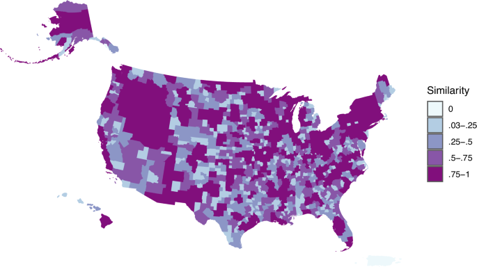
On the whole the comparison of the two delineations shows a relatively high level of similarity. The mean similarity score comparing the two delineations is 0.659, or 0.676 if the scores for Puerto Rico (not included in the 2010 delineation) are omitted. This value jumps to 0.752 if we weight scores based on population; confirming that the most populous places are more stable in terms of their commuting zone membership. Figure 1 shows the distribution of similarity scores for each county and shows both a high overall fit and the lack of any particularly strong regional effect when it comes to low similarity scores.

Map of Jacand Similarity of 2020 Commuting Zones and 2010 Commuting Zones.
Overall, the commuting zones for this delineation are quite similar to earlier delineations as further shown in Table 1. The only meaningful differences between the two delineations in terms of general characteristics are the smaller number of CZ’s identified in 2020 (particularly notable given the addition of 10 new CZ’s for Puerto Rico), the increase in the number of non- contiguous commuting zones (from 3 to 6), and the existence of a very small commuting zone (31 sq. km) comprised solely of Falls Church City, VA whose outlying counties shift to other commuting zones in the 2020 delineation. While there is no ‘correct’ number of commuting zones, the consolidation of CZ’s between 2010 and 2020 is consistent with the expected pattern of consolidation associated with continued growth of the largest urban areas and expanded commuting distances bringing smaller centers into the orbit of larger ones. Even the increased presence of non-contiguous counties is an expected, albeit sometimes conceptually problematic, outcome of increased commuting distances and remote-work opportunities. The existence of single county CZ’s has always been a problem for this delineation method, and the addition of Falls Church City to the list of single county CZ’s is a reminder that the original methodology included a step where expert opinion was allowed to modify the results-a practice abandoned for the delineations in 2000 and 2010 for its lack of transparency even if it likely increased the quality and usability of the delineations.
We can further examine the characteristics of the new CZ delineation by examining the fit characteristics of commuting zones and individual counties as described in Fowler and Jensen21. The purpose of this exercise is to better understand where and how commuting zones differ in terms of their fit with our theoretical understanding of how commuting zones should function. Fowler and Jensen21 distinguish between Core, Connection, and Containment as three theoretical frames for understanding functional regions. Here we examine these characteristics summarized for the complete 2020 and 2010 delineations. While a detailed examination exceeds the scope of this article, these values are also calculated for individual counties and as averages for individual CZ’s and made available with the provided delineation to aid researchers in understanding gradations in the way counties and CZ’s fit the theoretical frame we have established for them.
Core
Core refers to whether a commuting zone has an important economic center and how critical a role that center plays in the commuting zone. This concept is most salient in delineations such as those for (aptly named) core-based statistical areas where the role of this economic center is the driving point of interest. Core-centered delineations do tend to omit many rural places and make difficult and subjective decisions about how big an economic center has to be in order to count as a core. In advance of the release of 2020 metropolitan area delineations the Office of Management and Budget hosted a rather contentious discussion about raising the threshold size for an urban core from 50,000 to 100,000 persons34. While OMB ultimately decided to retain the 50,000 person threshold, the decision raises important questions about the role of economic centers in defining functional regions and so Table 2 reports information on how many CZ’s contain an OMB defined core county (77.6% in 2020) as well as what the average number of residents in a CZ who work in a core county (41%) and what the average share of the CZ workforce that lives in the core is (37%). The relatively low numbers for the latter two statistics are a reflection of the fact that many CZ’s are conceptually designed around inclusion of exurban and rural places. The results in Table 2 are encouraging for their relative stability. The number of metropolitan areas that get split does go up substantially from 36 to 44 but the Core measures are otherwise quite stable across delineations, but see the more detailed analysis of this phenomenon in the technical validation section below. Visual inspection of where and how much these values changed between delineations (omitted for brevity) does not raise any red flags about the new delineation.
Connection
Connection refers to the degree to which counties within a CZ are connected economically. Based on an examination of prior use of CZ delineations this has been most heavily referenced in the economics literature where the idea of a ‘labor-shed’ assumes that within a CZ wages should move together because the workforce can presumably choose to work for any employer within the CZ leading to an equalizing effect on wages within the labor-shed. Following Fowler and Jensen21 I implement a measure of pairwise wage correlation based on five years of BLS wage data so that the average pairwise wage correlation for county i is:
$$pwc_i=\frac12N\sum _i\in C\sum _j\in Cw_ijp_i,j,t$$
for each county i in commuting zone C and the other counties j in that commuting zone for year t. N is the total count of counties in C. Pairwise correlations are weighted by the share of the resident labor force reslf in counties i and j compared with the resident labor force in all counties k within C such that:
$$w_ij=\fracreslf_i+reslf_j2* \sum _k\in Creslf_k$$
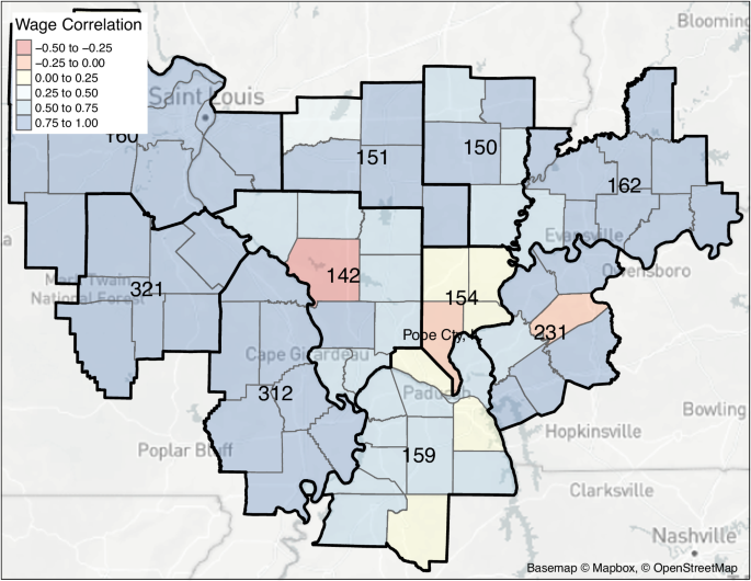
High values for this correlation indicate that ups and downs in wages over a five-year period are highly correlated within CZ’s at an average of 0.91 up from 0.84 in the 2010 delineation. A weakness with this methodology is that CZs with just a single county have, by definition, a perfect correlation so I also provide the correlation with single-county CZ’s removed, which is still high at 0.9. The minimum value across all CZ’s is also provided (“Min. Wage Correlation”). Initial inspection of the counties with low (negative) wage correlation does not reveal any systematic flaws, only counties that are quite different from their neighbors but no more similar to other nearby counties. An example is shown in Fig. 2 where CZ 154 on the Illinois/Missouri/Kentucky border includes Pope County, IL, a county dominated by the Shawnee National Forest and negatively correlated with the rest of the weakly correlated counties in the CZ. There is not a better location for Pope County in the neighboring CZ’s and so this is not a flaw in the delineation but rather a reflection of the fact that CZ’s are designed to be inclusive of rural places and that some places will better fit our conceptual model than others.

Detailed map of CZ 154 in Illinois which has the lowest mean wage correlation in the country. Pope County, Illinois is mostly Shawnee National Forest and is negatively correlated with the rest of the weakly correlated counties in the CZ.
Containment
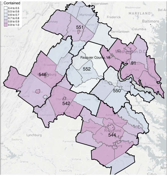
Finally, containment is the measure most closely associated with the original intent of CZ’s as a unit of analysis for studying rural places and their connections to economic centers. In this conceptual model CZ’s function like watersheds where every drop of rain that falls stays within the watershed. In total 93% of the U.S. population lives and works in the same CZ, a clear fit with this conceptual model. When we look at averages across counties within a CZ this number falls to 88% of the population as it does not account for differences in county population size or the comparatively lower containment rates in lightly populated rural counties. This value is unchanged from the 2010 delineation. The CZ with the lowest mean containment sits at 58%, down substantially from the 65% minimum in 2010. The culprit CZ is 552 in Virginia, which sits South and West of the D.C. metro area and North and West of the Richmond metro area. 552 contains Fauquier County, considered part of the DC metro area and exhibiting a strong negative pairwise wage correlation with the other counties in 552 (−0.28). Fauquier would seemingly benefit from being transferred into CZ 91 just to the North and East, but it gets pulled a little too hard towards the Richmond-centered CZ 543 to the South, and ends up serving as the ‘core’ for its own CZ instead of being attached to either of the larger metro areas. A careful examination of Fig. 3 demonstrates the way this pattern is repeated across the region with smaller CZ’s delineated between larger metro areas rather than being distributed to the major metros. A higher cutoff value in the hierarchical clustering algorithm would tend to reduce this problem, but would over-aggregate counties in other parts of the country where commuting patterns overlap less. There is not a clear misallocation here, only another example of the compromises entailed in any delineation seeking to cover a geography as diverse as is found in the U.S.

Detailed map of CZ 552 in Virginia which has the lowest mean containment in the country. Fauquier County, Virginia is part of the DC metropolitan area but also connected to Richmond, VA.
A comparison of the delineations for 2010 and 2020 confirms the general suitability of the new delineation in terms of the suggested fit metrics. The 2020 delineation appears largely similar to the delineation that preceded it suggesting that it should function reasonably well for longitudinal analysis or for work that seeks to replicate the observational conditions generated under earlier delineations. To this end, the generalized fit statistics should give researchers some degree of comfort that the underlying changes in where and how people work have not fundamentally reshaped the nation’s functional regions.
link

